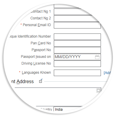
Does not support this width

HTML & CSS

We all know that HTML5 has made the web platform more powerful. The mobile web is growing up quickly, and tons of great HTML5 features are already supported on modern mobile browsers.

I was tasked to develop a library of controls with design standards and interaction patterns and streamline the ongoing product development. Created consistent and responsive applications for the best user experiences and fulfilled W3C standards.

The controls were tested on all modern web browsers and platforms.

  • Responsive Design

    Use of media query functionality in CSS3 I designed sites that can be browsed with multiple device.

    This site (shabukutty.com) itself is an example of the responsive design. The site responses to the number of device properties, such as screen width, orientation, and resolution. Incorporating media queries in the stylesheets help me to extent the real estate of the sections depending on the screen width.

    With responsive design complexity a content-centric approach was planed and tested accordingly.

    Responsive design
  • Smart Forms

    Smart Forms

    With tons of Rich Web Forms 2.0 elements building forms are quick. Now we can create elegant and new type of interactions and give the user instant feedback and support with no much of coding.

    Using the placeholder attribute I used this effectively for the web mobile app forms also built multiple web and mobile app using HTML5 & CSS3